Saturday, July 30, 2011

Let's do Prep!

So I'm working hard on my next project. It will be lots of fun but it is quite time consuming. In order to have you ready to create when I get the next posting up I thought I'd give you a chance to get some of the supplies together first. As usual you don't have to follow my tutorial exactly and you can change your mind on the use of material and just stick to the concept. That being said, our next activity will be a discussion of Warm vs Cool colours. I will be making a collage piece so you will need to gather colours. Yup, I spent an afternoon just going through magazines and cutting/ripping out different colour swatches. You will need quite a bit and you will need the whole spectrum : Blue, Red, Yellow, Green, Purple, Orange. You will also need something to stick the cuttings onto and something to stick it on with. I used a canvas board and Modge Podge I like this because it dries clear (so you can put a bunch of layers on top of eachother as long as they aren't too thick) and it unifies the gloss (You can get Matte, or Glossy).

That being said I am hoping to have this up by Monday at the latest. (Weekends are so hard to get things done) Until then I thought I'll leave you with a few Awesome sites that have Tutorials on them that I love.


Curbly - An AWESOME DIY site... 


Craftzilla Conquers the World - This is a friends crafty Blog.. check her out, she rocks!!


Not Martha :Marble Magnets  - This is a cool Tutorial on Marble Magnets.


Jonathan Fong Style :Warhol Kitchen - This guy is amazing, if I had my own house I would TOTALLY do something like this, (maybe not with Warhol though lol)


Have fun checking out these sites, and I'll see you back here by Monday :)!! 

So keep Creating!
Angie :)

Thursday, July 28, 2011

This thing called Colour!

So today I've decided to skip the history lesson and instead talk about this thing called COLOUR! I know, you are saying... "Wasn't that what we have been talking about this whole time??" Well, the answer is yes... and no. We've been discussing the USE of colour and but now lets talk about Colour itself :).
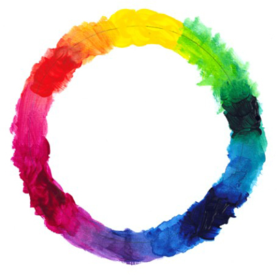
Colour Wheel Image*
So lets start with the basics.... the dreaded COLOUR WHEEL!

Why do I say dreaded?? Well, every class I've ever taught always follows my statement of "let's make Colour Wheels!" with a typical "SIGH!!!". (I blame it on mostly teaching children and teens.) So lets start:


You can think of this post as an Activity but not... all at the same time!

I've started with the basic supplies: PAINT- red, blue and yellow, Brush, Something to paint on. I am using watercolours this time, watercolour paper and a mid sized brush. (Watercolours are the easiest to use because you can just add water to make them change.)


First we start with a structure. I like to draw my colour wheel out first, 3 circles, 3 squares and a triangle like so (Don't mind my crappy photo's today. My lights and Camera weren't cooperating):

Basic Form
 Then I add Red, Blue and Yellow into the circles. These are a thing called PRIMARY COLOURS. No other paints can ever make these colours! You can use these colours to create most other colours.

Primary's So Far!
 Then in the squares I mix Red and Blue (which will make Purple), Blue and Yellow (which will make Green) and Yellow and Red (which will make Orange). These are called Secondary Colours.

Our Colour Wheel!

The neat thing with Secondary colours is that they compliment the Primary colours opposite them. This is why Christmas colours go so well (Red and Green)!

Yellow and Purple, Red and Green, Blue and Orange
With the invention of a million and one colours that you can purchase out of a tube you may think you don't need to know how to mix paint. Well, because of the insane amount of colour variations, you will find that being able to mix your own paint will always allow the colours you use to mesh nicely. The mixed colours will always be in the same tonal range as the base (primary) colour you used. What is fun to try in used a variety of blues, reds and yellows to see how they mix and what types of greens, purples and oranges you can get.

One thing to remember... you can always alter the shade of the mixed colour as well. If you add more blue to a purple it will be a cooler colour and more blue tinted... more red and it will look more burgundy (Tertiary Colours are Primary + Secondary, ex: Blue + Purple = Blue-Purple) . This is also something interesting to try if you never played with mixing colours before. I highly recommend using a scrap paper and trying out a bunch of different combinations to see what you get.

Now what do you notice if you mix ALL THE COLOURS TOGETHER? You get a yucky, mucky, browning colour... neat hunh?

If you need a colour darker add a little black (FYI: most black paint is blue tinted) and if you need it lighter (want to make pink) then just add some white (white + red = pink).

I found an AWESOME explanation of the Colour Wheel that you can buy in stores at this site: Curbly: Colour Wheel Romance. So if you want to further you knowledge check them out! :)

As for me I'm going to keep playing with my colours and next time we'll talk about WARM vs COOL colours.

Keep Creating
Angie :)

*Image from Acrylic Painting for Dummies by Collette Pitcher

Wednesday, July 27, 2011

Activity: Shape without Form

This activity was an enjoyable one. I love making images that don't require the precision of realism. As discussed in the previous post about Borduas' "Leeward of the Island" (shown Below) you can create a scene, movement or most things specific, without ever using specifics. So as our title suggests, you can create shapes without the specificity of natural form or realism.

"Leeward of the Island" 1947, Borduas
What you will need in this activity: Something to make colour with (paint, markers, pencil crayons, etc) and something to make marks on (paper, canvas, board, etc.). The reason I am so broad on the supplies is that there isn't just one way to ever make art. You can take this concept and apply it to any kind of art, heck I tend to do a lot of Collage works (which we will discuss in the near future) and most of these activities can just as easily be done with coloured paper and a glue stick. I also stick to the idea that these activities can be done by ANYONE! You just need yourself and your imagination.

Stuff!
For this activity I started with paper (I used watercolour paper being it's what I had and it's thick enough not to turn to mush with lots of paint on it), acrylic paints and brushes. My red paint has seemed to have dried up (*pout*) so I will be needing to replace it, this being said I didn't need to use many colours for my creation.

I decided to go with a swimming/beach theme... you don't need a theme if you don't want one. I just find it easier sometimes if I have a theme to think about and an emotion to use that the theme generates. This being said, I love the beach, I'm not much of a swimmer but the idea of playing in water and having a good time makes me happy.

Blue! Just blue paint and varying amounts of water!
I started with a flat blue over the whole paper. If you look closely I didn't make it a solid blue, I used more water in some areas and thicker paint in others. This gives the blue movement and depth. I then dabbed in Dark Brown, Yellow and Blue to make a land mass. (Info: Yellow and Blue make Green... this is part of the colour wheel which I will discuss next post) I didn't do a lot of mixing colours but the land seemed to need green.

I added Brown first then dabbed Yellow and Blue over top of the dried paint!
Now comes in the shapes. Using straight lines, circles, and triangles I was able to create the idea of people in the water, a dog on the grass and a beach ball floating by. To add depth I started with Black and added brighter colours after each colour dried (make sure the lighter colours are added onto dry paint or they will all blend into one another). I used different strokes as well as different sizes of brushes to create the scene. As a final touch I added some white paint at the top to represent clouds or I find it kind of looks like the froth of a waterfall just off the canvas. :) The main point is using simple shapes or brush strokes allowed me to create the feeling of people without having to be specific about them.

A few people, a dog (on the grass) and a ball... just triangles, circles and blobs :)
Another person... had to have someone swimming after the ball  :P
I hope you have fun trying your hand at this. I know I've had a lot of fun creating this image... I may even do another later on!

Final image: The dog is kinda hard to see in the picture... but you get the idea. Lets call it "Beach Day"!
I would love to hear how your images went and what theme you decided to go with, if you even went with a theme. Remember: Everyone does it different. There is no right or wrong!!
 
Have fun Creating!
Angie

Shapes without Form... Borduas Pt2

We have made it through 2 activities, and a few posts. YAY US! So let’s keep this going. I am hoping all you out there actually share this site once and a while. It would TOTALLY Rock if people may actually come here other than my few friends that I know are awesome. All of you who are here that aren’t my close friends... You ROCK! 

Okay, so onto the art. 

"Leeward of the Island" 1947, Borduas

Today I wanted to talk to you more about the artist Paul Emile Borduas. Last post seemed a little art history essay-ish to me and I’m not sure I want all the posts to have that feel. I apologize in advance because I am sure that it WILL happen again, even if I don’t mean it too. I feel that we have covered the history of this artist enough for our purposes at the moment, but I really wanted to talk about the work “Leeward of the Island”. I know this work is actually older than the two from the previous post but in an artistic eye and abstract progression, I find this one is next on the list. 

We have now talked about Colour (with Guido) and Texture and Depth, but what I wanted to move us into is the concept of Shapes without Form. I know this doesn’t really make much sense, so we will start by looking at the work. 

From examining the painting in relation to our previous post you can see that this work is much more expressive and while still being abstract, is also figurative. You can tell that the markings are meant to be figures of some sort, that the mass is meant to represent land, and that the painting in general is meant to have shape and expression and be a statement on something specific. You can tell this... but what I want to focus on today is what is not there. There is no specific shape involved here... there is no true realism. This work manages to express SHAPE without having specific FORM. This is done with the use of Colour and Depth... by creating sweeping movements on the canvas and marks with the brush. Borduas uses bold colours and different strokes to create the "idea" of an island and feel of figures. The shapes on the image can be representational of people but they do not specifically have any of the characteristics of realism! However, when we look at the image we know that they are meant to represent forms.

Our next activity will build on this concept... of expressing something specific or real without using realism or specific form. Instead we will be using colour, mark and movement to create the idea of figure, thing, person... etc.

So let’s Create!
Angie

Here's the activity as promised! Activity: Shape without Form

Monday, July 25, 2011

Activity: Colour, Depth and Texture


So in keeping with the concept of Colour, Texture and Depth that we started with the discussion on Borduas' paintings "Aquarelle no.4" (above) and his work "The Black Star" (below), our next activity is a very easy, and lots of fun! I actually enjoyed this one enough that I decided to create 2 images. So I will post the first on within the discussion of how to make them, and the second one afterwards.


What you need for this exercise: Something that makes colour (markers, paints, chalk, pencil crayons), something to put colour onto (canvas, board, paper, etc) and that's about it!

My Supplies: Watercolour Paper, Brushes, Paint!

This exercise is all about texture and colour. Our main lesson is about CONTRAST! Contrast is an amazing tool for all artists. It helps create depth and movement and emotion. The easiest way to explain contrast is by thinking about anything that stands out or seems prominent. A lot of websites use contrast to create bold and punchy images, as well as the use of colour to create interest.

Starting to apply Yellow. REMEBER: It's easier to cover Light with Dark than the other way around

So think of it this way: Anything DARK against anything LIGHT will cause contrast, this will deepen the image! We are also looking at movement (as discussed in our first activity) and Texture.
Yellow mostly done.


 How do we create texture? Well if you are using a thicker paint then you can blob it on, this is what I did with the Yellow. Each colour I used I tried a different way to apply the paint: Jabbing, Sweeping, Making circles, etc. Whatever way you apply the paint onto the surface will create texture, and once you use contrasting colours this will create depth.
Paint Texture!

Adding Red (Above) and Blue (Below)
Remember Red, Yellow and Blue are PRIMARY COLOURS.
I will get more into this in our next post :)


Have fun and play with colour combinations, mediums and application processes. If you are using markers or pencil, remember that however hard you draw the darker the colour, so you can create different texture and colour just by pressing differently.

Final Image... I'll Call it Fire in the Sky! LOL :)
 Remember! It's about Process... Making ART! Having Fun and Experimenting.
It is NOT about the final project... if you enjoy what you are doing the final image will pull together on it's own. :)

The start of Second Image :) YELLOW again!
Lets call it "Sun at Night" ... something fun and simple.


 I hope you have fun creating! I would love to hear about your adventures in art!!
Angie

Depth and Texture... Paul Emile Borduas Pt.1

I have to state straight out that Paul Emile Borduas is one of my favourite Canadian Artist (also from Quebec like Molinari). I think a part of my ever present love for this artist is his having been trained by Ozais Leduc (whom I will probably talk about at some point) and his progression from Ozais’ realism to Borduas’ use of abstraction.  Having studied realism Borduas, at the age of 36, started trying his hand at abstract painting! One of the best quotes from him is: "Children, always of great interest to me, opened up the way of surrealism, of automatic writing. The most perfect condition of the act of painting was finally unveiled." This is exactly what I wish to express for our exploration of art: simplicity and the ever present concept of Process vs Product (I know, I keep saying that but seriously it is SO TRUE for all artists no matter age and skill level?)

"The Black Star" from 1957 by Paul Emile Borduas

Some of his works are similar to the works of Molinari but with less emphasis on smooth coloured surfaces and instead a focus on paint as a texture and the use of colour. Being a large part of the Automatisme movement in Montreal, his abstract paintings became a symbol of the era. His painting “The Black Star” from 1957 is oil on canvas that has become one of his most popular paintings to date. This was created just a few years before his death and is one of his most striking images. The stark contrast and simple use of shape and paint are superb use of minimalistic qualities and expressions of abstraction (mainly movement, form and texture). 

This is one of two great pieces that I will talk about. The second is “Leeward of the Island”, which I will talk about in my next post. For now we will continue on “the Black Star”.
"Leeward of the Island" 1947, Paul Emile Borduas

Having taught many types of artists with a wide variation of abilities and skill levels I have always found that “the Black Star” is the next progression of the use of paint. We have moved from viewing painting as a representation of the colour(s) and the forms, into a vision of texture and depth. There is nothing written that ever states that painting must remain flat surfaced and smooth. This, however, is the view of many in the representational use of the medium, mostly due to the productions of prints. Prints have always been an unfair mode to view abstract and textured images, they are great for exposure to the artists and I do support them, but there is always something missing in the flatness of a print. I highly recommend going and seeing some of these in person!!

 "Aquarelle no.4" 1957, Paul Emile Borduas

Our first activity will be about the use of texture and depth. Not all mediums will allow for texture (water colour for example) but that doesn’t mean they cannot have depth. In Borduas’ image “Aquarelle no 4” from 1957, which is a watercolour, you can see that Borduas is using colour and movement to create a sense of texture. He has allowed pieces of his work to dry and then added new colours on top of them creating depth and form. He also uses contrasting, high impact colours to make the forms jump off the page. This is an easy concept to explore at all skill levels with a large variety of mediums (paint (oil or acrylic), watercolour, chalk, pencil crayon, you name it!). 

So lets Create!
Angie :)

Here's the activity for Pt.1 : Colour, Depth and Texture

Wednesday, July 20, 2011

Activity: One colour painting!

In this activity we are going to start with a very easy abstract exercise. You can use paint (of any colour) and paper (or canvas/board), and/or any other material that you may wish to use instead. (One of my friends did this with Cardboard of different colours, Paper, and Glue) 

 "Two Oranges" Guido Molinari 1963

"Black/White 1956" Guido Molinari 1967

We are going to look at two different Molinari pieces... “Two Oranges” from 1963 and “Black/White 1956” from 1967. The nice thing with these pieces is they’re open ended... what do I mean about this? Well they are not set in stone, they are something that anyone can do and they are an easy concept but allow for large amounts of variation.

 Supplies : Paint, Brush, Board and Water

In order to create any of these you can start with a base colour (if you want your base colour to be white all you need to do is leave the canvas or paper white... why waist paint J ). I like to choose the colour (or colours, there is nothing stating you have to stick with one) and paint the WHOLE BOARD that colour... it doesn’t have to be fully coloured and it doesn’t need to be thick. 
 Blue!

Once the board is painted you can either use a paper to help as a straight edge, or a fun alternative is painter’s tape. If you use painter’s tape you can lay the tape any way you choose. This will keep the colours under the tape the base colour. Then paint over the painter’s tape and everything on the board.
Again you don’t need to stick to the same colour, but if you do it will resemble the concept of “Two Oranges” by creating darker and lighter versions of the same colour across the board. If you decide to put the tape (or use a straight edge and free hand the lines) in different angles the result will be more similar to “Black and White 1956”.

 I used a paper as a straight edge to create the corners and then added more blue!

This is a fun and easy exercise to explore the use of paint as a medium. If you use different colours you will start to see the effects of combining colours and creating new colours from them. Start with a few colours and expand if you want to further explore this idea. 

 Just letting it dry, I use newspaper underneath so I don't make a mess and a paper to help with the lines in the middle.

 Finished Product: Blue and You :)

So go and try your creations and feel free to let me know how they come!
Have fun creating!
Angie :)

G is for Guido!


When studying Canadian Art, or any form of art, there are a large number of artists that you can draw upon for inspiration. They range in age, era and style. They also range in types of material from drawing, painting, photography, and so on. For me, where I like to start a new artist is with Guido Molinari. Guido is a Canadian abstract artist from Montreal whose works have been shown in most (if not all) Canadian major museums. I could go on about his history as a leader in Canadian linear abstraction and all the great things he did for Canadian Art as well as the abstract movement but I will instead stick to the art as it is and the theory behind it.

When discussing Linear and Colour abstraction, or even negative space, Guido Molinari’s works will be one of the main artists that should come to mind. Now most people will say the usual... “It’s just lines, my 5 (2, 8, whatever) year old can do that”. My answer to this is.. “Yes! Ain’t it great?” and people look at me like I’m crazy.  Abstract art is one of the major examples of Process vs Product. They don’t care if the tree looks like the actual tree, they don’t care if there is a house or if the painting “makes sense” in a realistic view. Instead it’s about the process, and the materials used. I will explain it this way... Abstract art is Painting to show Paint... or colour... or movement. It’s about the colours that you use, and the use of your body to create a line or the paint itself.

Linear or Colour abstraction is about the colour... about questions like “what is red? What does RED mean? How do we express RED for RED!?” or even broader questions like “What is paint? What is colour? And how do they relate to each other?” If you look at most of Guido’s work you can probably ask one of these or another similar question and see the progress he makes. He starts with a concept and as the concept expands he creates more to explore the ideas and expand his own need to learn. Abstract art is never stagnant. It is always moving. 


Now for the big question... How does this relate to learning art? (Especially in a PDD or new artist perspective)

Well Abstract art is all about the concept of Process over Product. When working with the PDD community (from Autism to Down syndrome and most anyone in between) I realized that many “workers” ended up trying to over help my students. We, as a society, get it in our heads that we have to create a carbon copy of the teacher’s works. That art is creating likenesses of real things, and that we must do it the way we are told. This is wrong! Art is about exploration... of oneself, the medium and the process... it’s about having fun and expressing oneself any way we can. This is the best part of Abstract art... there is no right or wrong! Anyone can create movement, colour, and line (And I never said straight lines)! By starting my students on Abstract Art, and giving them the tools to create how they want to, the “workers” thought less about correcting their trees and trying to create a carbon copy of my work, and started helping more fuel ideas and allow the students to find their own way of doing things. I have recently talked to people in other aspects of care... early childhood educators, Persons with Developmental Disability workers, Retirement community workers, etc... They have all been adopting the idea that the best way to learn something is to give the student the tools and help them on their journey to create (NOT correct)!

So Lets Create!
Angie :)

Activity: One Colour Painting is related to this post!

Monday, July 18, 2011

Canadian Art beyond the Group of Seven!

The Group of Seven have been the bane of my University Career. For as long as I remember (and I have been teaching art since gr. 7) if you asked anybody to name you their favourite Canadian Artist they will say Tom Thompson or one of the Group of Seven 9 times out of 10.

( Lawren Harris )

Why does this happen? 

Well, in school and in society people tend to find something that interests them and it encompasses their entire perspective. The Group of Seven have bombarded our visual and historical psyche since middle school, being one of the main artists anyone studies and one of the few taught in school. They have been the focus of Canadian Art forever and are some of the most publicized Canadian Artists. Propaganda has a lot to do with it (but I won’t get into that just now). This, however, doesn’t mean that we have to stick to this concept and keep the group of seven as our favourites or limit our knowledge to just them! We are all amazing artist and can expand our knowledge of other great Canadian Artists and then create an informed decision!

I will probably discuss techniques and theory behind the Group of Seven at some point but I will tell you plainly that they have never been one of my favourites. I also feel that they have been over discussed and so will try and talk about other lesser known artist. There are many great Canadian artists throughout the ages that have just as much to offer as the Group of Seven and I would love to explore some of them with you over time.

In my next post I am hoping to start showing some activities that are open ended and allow for all skill levels to experience Art and Canadian Art to its fullest. I am a strong believer that abstract art is one of the most versatile and open ended concepts available. I will probably start with an activity centred on abstract Canadian Art, more than likely Guido Molinari. If you wish to pre-emptive look up his work I will start you with one of my favourites. 

(Guido Molinari)


For now, keep creating!
Angie

Thursday, July 14, 2011

What is ART?

As my first post on this site I would like to start off with my definition of ART. This may not relate directly to the dictionary's version of art but more towards what you may expect to find on this site over time.

Art

My definition of Art has always been fairly broad. I feel that art is anything that you create in order to express yourself. This can range from drawing and painting, to photography and digital media, to writing and literature. Anything that YOU feel is a visual expression of your thoughts, feelings, anxieties, loves, hates, etc... can be classified as art. Music is a form of art but I will not be discussing this aspect as much as the visual arts.

Who can do art?

In short... ANYONE and EVERYONE!

It is a falacy that art can only be created by a set few. You DO NOT need to be able to draw a straight line! You DO NOT need to have specific talents! If you live and breath you CAN do art!

Product vs Process!

I may put on tutorials. I may put up discussions... but ALWAYS remember. It's about process... NOT product! Your tree NEVER has to look like my tree... heck if you don't want a tree then don't put it in.

Art is about self expression! What this means is there's no right or wrong way to do art. Every person will do it differently because they are a different person. That's what keeps art, and the world, interesting and exciting. So have fun with it.! Enjoy making art and don't worry about how it turns out in the end.

History and YOU!

There are times I may do discussions on Canadian or popular artist. This will be done to enhance your knowledge of the art world and explore new things. I am hoping to have small activities after these discussions so you can try the techniques or the expression. Remember there is NEVER a right  and wrong way as long as you are having fun!!

So have fun and create!!
Angie