So in keeping with the concept of Colour, Texture and Depth that we started with the discussion on Borduas' paintings "Aquarelle no.4" (above) and his work "The Black Star" (below), our next activity is a very easy, and lots of fun! I actually enjoyed this one enough that I decided to create 2 images. So I will post the first on within the discussion of how to make them, and the second one afterwards.

What you need for this exercise: Something that makes colour (markers, paints, chalk, pencil crayons), something to put colour onto (canvas, board, paper, etc) and that's about it!
 |
| My Supplies: Watercolour Paper, Brushes, Paint! |
This exercise is all about texture and colour. Our main lesson is about CONTRAST! Contrast is an amazing tool for all artists. It helps create depth and movement and emotion. The easiest way to explain contrast is by thinking about anything that stands out or seems prominent. A lot of websites use contrast to create bold and punchy images, as well as the use of colour to create interest.
 |
| Starting to apply Yellow. REMEBER: It's easier to cover Light with Dark than the other way around |
So think of it this way: Anything DARK against anything LIGHT will cause contrast, this will deepen the image! We are also looking at movement (as discussed in our first activity) and Texture.
 |
| Yellow mostly done. |
How do we create texture? Well if you are using a thicker paint then you can blob it on, this is what I did with the Yellow. Each colour I used I tried a different way to apply the paint: Jabbing, Sweeping, Making circles, etc. Whatever way you apply the paint onto the surface will create texture, and once you use contrasting colours this will create depth.
 |
| Paint Texture! |
 |
| Adding Red (Above) and Blue (Below)
Remember Red, Yellow and Blue are PRIMARY COLOURS.
I will get more into this in our next post :) |

Have fun and play with colour combinations, mediums and application processes. If you are using markers or pencil, remember that however hard you draw the darker the colour, so you can create different texture and colour just by pressing differently.
 |
| Final Image... I'll Call it Fire in the Sky! LOL :) |
It is NOT about the final project... if you enjoy what you are doing the final image will pull together on it's own. :)
 |
| The start of Second Image :) YELLOW again! |
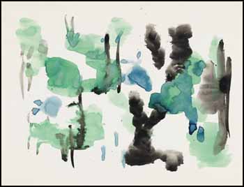
 |
| Lets call it "Sun at Night" ... something fun and simple. |
I hope you have fun creating! I would love to hear about your adventures in art!!
Angie
No comments:
Post a Comment