 |
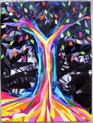
| My Tree |
As promised I have managed to finish our next activity/lesson plan. Of course I decided to do the most time consuming method and make a large image for the project but I had a lot of fun doing it. Call me a sucker for punishment. I am going to combine the information within the lesson being it is easier to explain as you see the image progression. Our discussion today is about the difference between WARM and COOL colours. These differences will help you with using colours later in your art and helping you create the "Feel" of the image that you are looking for. Lets start with the break down:
What are WARM Colours? The easiest way I find to describe warm colours is as any colours you would think of on a hot summer day. They usual consist of Red, Yellow, Orange and the variations within that spectrum. Cool Colours on the other hand are what you think of as winter or some say rainy days. They are usually muted and grey feeling. Blues, Green and Purples usually fall into cool colours (there are always exceptions, warm and cool variations of these base colours). So if it's hot feeling think warm... cold feeling think cool. Another way to look at this concept is that warm colours will stand out or seem closer to you than cool colour (which sink into the background). This is the basis for our next activity.
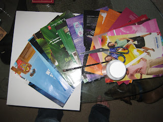 |
| My supplies |
What you need: I used clipping of colours from magazines, scissors, a canvas board to put it on and mod podge. You can either use this or even colouring crayons. The nice thing with this activity is you can even do it with kids using colouring book pages.
I decided to do a tree on my own. Your other option is to find an image (something simple and big) from a book or magazine or even a colouring book to paste the colours over top of. For your first time trying this sometimes having a set image and guidelines helps.
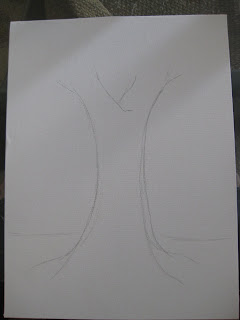 |
| The base drawing |
Once we have our base outline or image set (I just drew with pencil onto the board) we are going to start using the colours we pulled out of the magazines. I started by organizing them in order of cold to warm... so the Blues are at the back of the pile and the Yellows are at the top. My order (based on placing the colours next to each other to see whether they pop out more of less to the colours next to them) is Blue, Green, Purple, Red, Pink (Pink is not needed, I just wanted a bit more variation in the warmer colours), Orange, Yellow. I use Black/Grey as background colours.
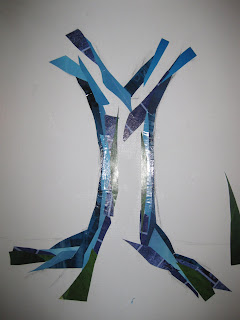 |
| Starting with Dark Blue, Light Blue, Green and Purple. |
I then took my first colour (the furthest back, other than the background) and cut it into strips and shapes. You don't need to cut it in any specific way, I figured with a tree curves shapes and lines would be easiest). Now's the fun part... start pasting! (Below is the progression of my images)
 |
| Addition of Red |
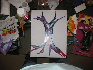 |
| My Mess :) |
 |
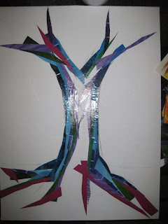
| Pinks and Reds |
 |
| Oranges to the center being that would be the closest part to you! |
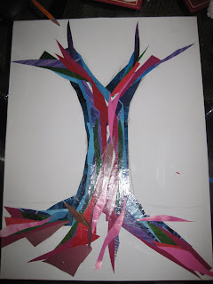
 |
| Yellow is then added, I also added some more pink and orange to the lowest part being that is closest to you!! |
 |
| Starting with the background |
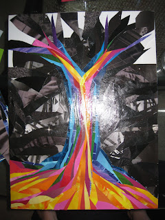 |
| I used black and greys, I always find a bit of pattern in the colour adds interest. |
 |
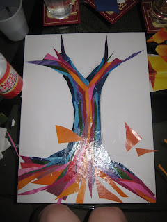
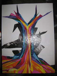
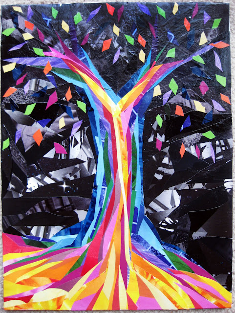
| All the board is now covered. I then decided to add in some leaves for interest. |
Look at your image! Make sure the stuff away from you is in the cooler colours and the stuff closest to you is in the warmest colours. This may take some time, my image was quite big and took me quite a while to get it done. I recommend, if you are using Mod Podge to glue your work, to put a cote of it (not too thick) over the whole image. I usually put 2 or 3 thin coats (let the image dry completely between coats) to even up the image and seal any of the loose end of paper in.
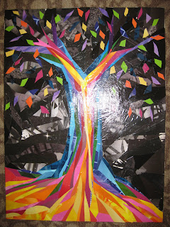 |
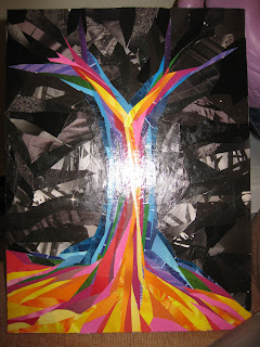
| Notice how the warmer colours seem to punch! You can't see it much on the picture but there are leaves in the cooler colours as well. |
 |
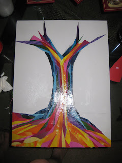
| All Done (as promised, a new photo :) ) |
Once finished stand back and marvel at your masterpiece. See how the warm colours (the yellow especially in mine) pops out of the image... it's like built in shading with colours.
Have fun Creating! Let me know how it goes :)
Angie


Ang, this is so beautiful.
ReplyDeleteThis is AWESOME! You rock my socks off!
ReplyDelete